September 18, 2015
iOS Pro, part one

Last week, Apple announced the iPad Pro, its most ambitious move yet to position the iPad as more than a casual-use (and niche-use) device. The hardware is unquestionably up to the task – Apple boasts that it’s faster than 80% of laptops sold in the past year, with a screen packing more pixels than Apple’s own Retina Display MacBooks. Yet even with all this, the iPad Pro will be held back not by its hardware, but by its operating system. A bigger form factor may signal professional ambitions, but what’s truly needed for the iPad to rival desktop environments is not an iPad Pro, but an iOS Pro.
The iPad as it stands fits the needs of some professionals. Viewed in a jobs-to-be-done framework, there are some jobs for which many will find it the best hire, but these tend to be all of a kind: They are performed by a single application with a narrow scope, such as a note-taking app to brainstorm or a marine navigation app to pilot a boat. The iPad pro is being pitched to professionals whose needs center around using more applications, with broader scopes, with deeper networks of relational structure (that is to say, more files used together), none of which iOS was originally designed to work with. A big screen, a keyboard, even a high-fidelity pointing device do nothing to address this.
In this series of posts, I want to examine some of the shortcomings iOS has in offering a versatile, professional, creative environment, while proposing some potential solutions to them. The first is multitasking.
Limitation: Multitasking
iOS 9, in anticipation of the iPad Pro, adds split-screen multitasking. It’s clear a lot of thought went into this particular approach, and it’s naturally much cleaner than wrangling a mess of floating windows. But it has one major drawback that stems from the very core of the iOS app-centric model.
It’s actually a little absurd: In the on-stage demos, Microsoft’s Kirk Konigsbauer demonstrates the ease with which you can load up a Word document and a PowerPoint deck side-by-side. What he doesn’t show is that the moment you want to load a second Word document into that other pane, something possible since Microsoft’s Multiple Document Interface in the late 1980s, iOS will stop you: There’s simply no way to do it, because the app-centric paradigm of iOS has no room for document-level UI separation.
Solution: Share the metaphor
It’s not too hard to imagine a solution that can leverage the app-centric paradigm of iOS into something supporting multiple documents from the same app. Apps and documents both share the metaphor of the window on the desktop, so why not let them share the iOS pane model?

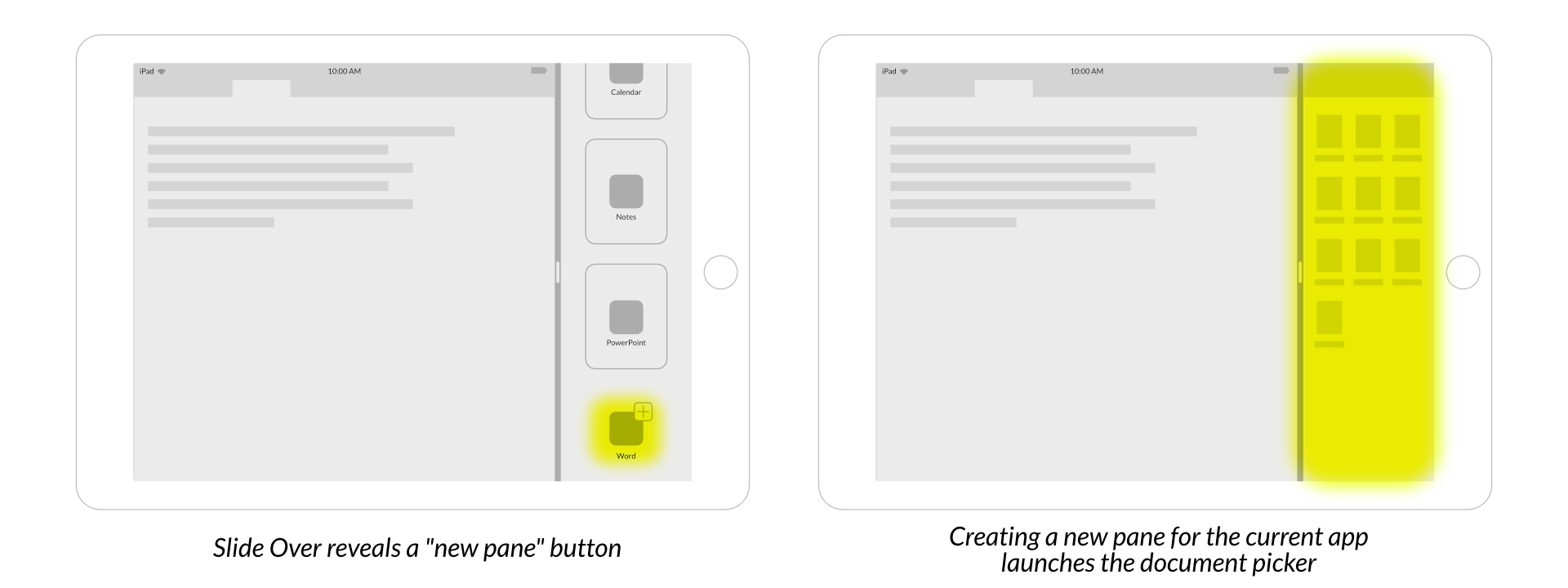
In an application that supports it, the slide-over menu gains a new option at the bottom for the current app. Tapping that instantiates another view of the app, defaulting to the document management or “open” view. The underlying iOS process model would likely need an overhaul for this to become a reality, but it’s a necessity.
Next
Efficient management of multiple applications and multiple documents is a critical part of many professional workflows, but it’s far from the only part. The next installment will look at the concepts of files and projects in our hypothetical iOS Pro.