May 31, 2013
Flat is not the opposite of skeuomorphic
I don’t remember exactly where I first encountered it. But at some point in the past three years, I, along with a large contingent of user interface designers, fans, and industry followers, learned a new word: Skeuomorphic. A skeuomorph in the UI world, so the popular definition goes (even if the rigorous scientific definition of the word makes “skeuomorphic design” an oxymoron) is a GUI or elements of a GUI that borrow from a physical analog of their functionality. It seemed like a useful concept in defining the execution of user interfaces, with an added benefit of sounding exotic in conversation – but I think we may have outgrown it.
Everyone loves a feud
Somewhere along the way, this newly-popularized concept gained that one thing critical to capturing our collective imagination: a foil. Where skeuomorphism was tied to the familiar, the tactile, the rich, the warm, this dark horse was divorced of the familiar, lived in platonic ideals, was simple, cold, mathematic. Despite drawing most of its theory from the 20th Century’s signature design movement, Modernism, it was nonetheless given its own, rather less impressive (and more prescriptive) name, “flat design.”
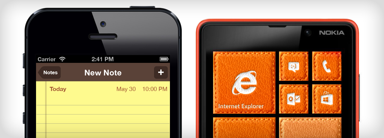
As the story goes, each of these poles had its champion, with Apple raising the varnished-oak banner of its increasingly unified mobile and desktop design language, and Microsoft carrying the solid, rectilinear flag of what was briefly but indelibly called its Metro design language. A war was brewing in the UI design world between flat and skeu: Apple’s rumored “move to flat” would stir more design-office conversation than a betrayal in Game of Thrones.
Not so flat
There is a problem with this narrative. Much of the interaction that users have with iOS devices is with UI elements having no physical analogs apart from the most basic, localized physical metaphor, the button – most of these are even just black Helvetica on a white background. And for all of Microsoft’s eschewing of texture, shading, and object references, one cannot escape that its many boxes and encircled icons ultimately draw affordance from our associations with a physical object, the humble pushbutton.
So if much of iOS is “flat,” and Windows Phone is loaded with a thousand tiny skeuomorphs, what are we left with? An important realization: “Flat design” is not nearly as flat as it looks. Skeuomorphism is a critical part of interaction design, and is everywhere.
How, then, do we verbalize the many clear differences between the examples of iOS and Windows Phone? The answer is to build a more nuanced framework than “flat” versus “skeuomorphism.”
Building a more useful vocabulary
Instead of imagining a fun-to-follow, yet ultimately empty battle between the forces of skeuomorphism and flat design, a more productive pursuit would be to construct a vocabulary around the toolset these concepts offer. Here are a few tools I see:
Functional object reference (“skeuomorphism”)
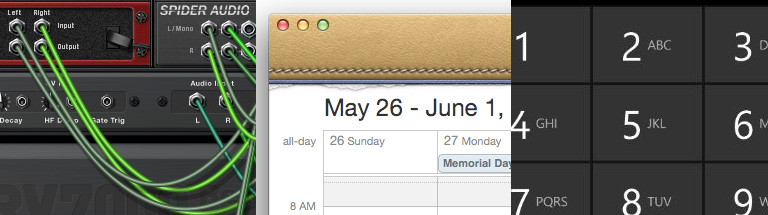
Propellerhead Reason, Apple Calendar, Microsoft Windows Phone 8 dialer
This is the sort of visual metaphor that ties an object from the physical world to a virtual tool. Ideally it is for purposes of building affordance from familiarity (turning pages in iBooks), but it can easily be misused (non-functional pages in iOS Address Book). Regardless of how realistically it’s rendered, a physical object can be useful as a reference so long as it is recognizable by the user and responds in the same way.
Material/texture reference
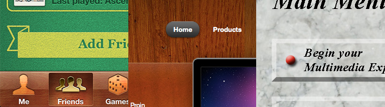
Apple Game Center, Quantum WordPress theme from Themesorter, artist’s rendition of 1990s CD-ROM menu
The difference between this (which you may call skeuomorphism as well; I won’t stop you) and the previous example is that the metaphor is implicit, if present at all. Ideally, there is some implied metaphor: Apple’s Game Center may not actually play backgammon, but its material references to a vintage board game case can put the user’s mind in a conceptual space for gaming. Often, this tool is simply used for decoration, but tasteful decoration can still aid user experience.
Depth cues
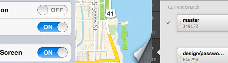
Apple Notification Center settings, Apple Maps, GitHub for Mac
Whereas the previous two tools always use concrete references, depth cues may or may not have such a clear analog. Their primary purpose is to imply what can be done if the user interacts with the controls they adorn, not referencing real objects themselves, but rather mechanical aspects of them.
Shape / color cues
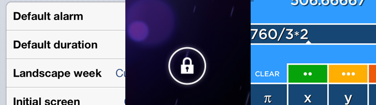
Calvetica settings, Android lock screen, Solve for iOS
Contrasts in shape and color are often used in conjunction with depth cues to further increase contrast and create visual hierarchy. The trend of “flat design” is to use them with minimal application of the other aforementioned tools, which can be successful so long as the application of shape and color contrasts are sufficient to create an affordance of user action.
Addition and subtraction
My current one-liner for when the subject comes up is “‘flat design’ is approximately as useful a term for user interfaces as ‘red design’ or ’round design.'” Far from being a shot at the popular aesthetic of relying heavily on it, though, it’s meant to provoke thought: Flatness and depth are tools, just like color and shape, affordances and analogs.
Don’t just practice flat design or skeuomorphic design. Use the tools that are right for the interface that’s right for your users.